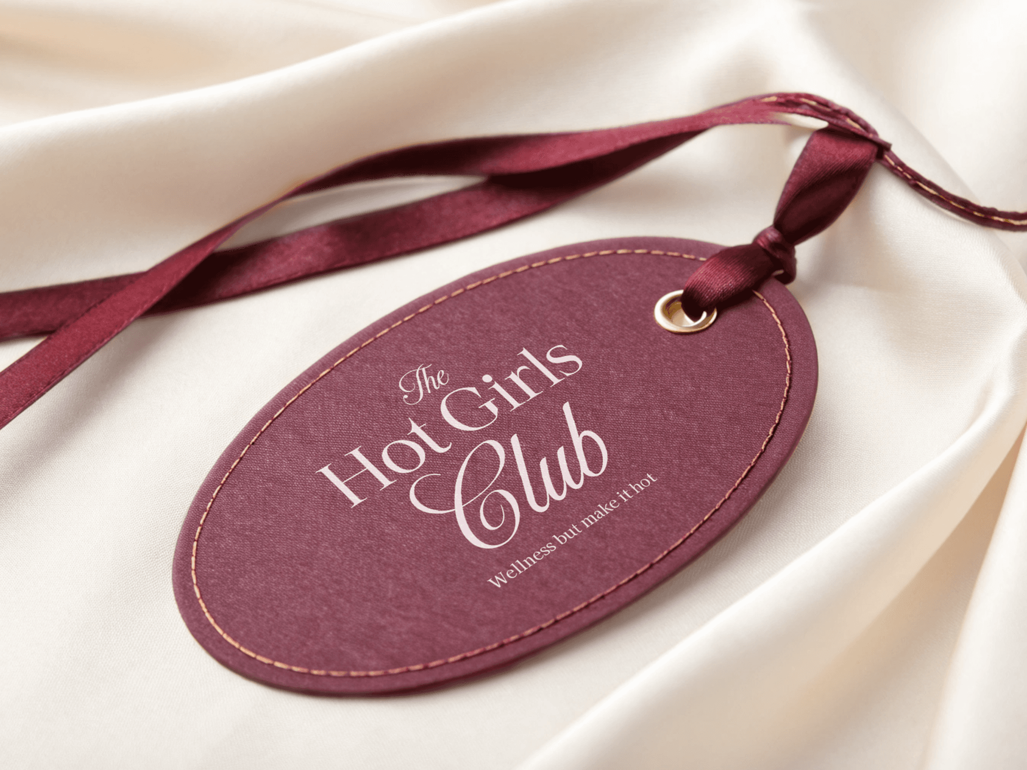
The Hot Girls Club
Intentional branding project for a modern wellness community, including brand strategy, tone of voice and visual identity to redefine wellness as a sensual, structured and magnetic lifestyle.
Branding
Project Overview
Client: The Hot Girls Club
Industry: Wellness & fitness
Timeline: 12 weeks (2025)
My Role: Art director
With the need for a strong wellness brand that not only builds community on social media but extends the brand into curated, on-strategy product lines and wellness events in Puerto Rico and the U.S. The Hot Girls Club was created to turn wellness into a real, lived community and a sustainable business model.
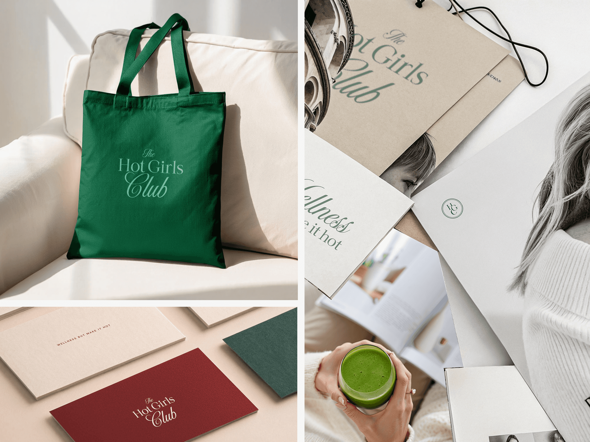
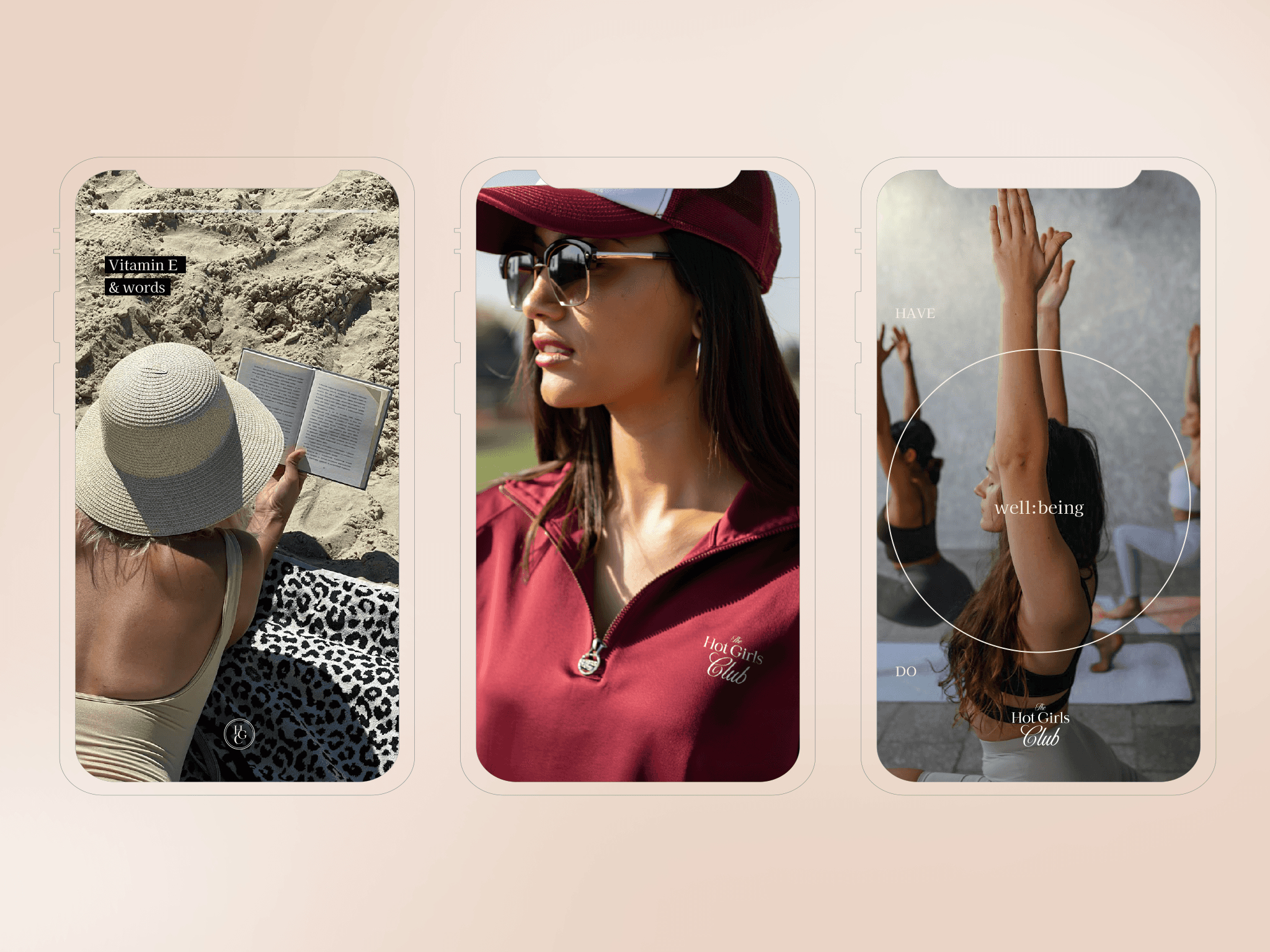
This branding project defined its strategy, positioning, tone of voice and visual identity to create a wellness club that feels approachable, intentional, magnetic and editorial, but still familiar and human, like a space you’re invited to belong to, not perform for.
Design process
Project timeline: defined scope and deadlines upfront to align expectations and organize the work in clear phases.
Brief kickoff: held a kickoff session to understand the client's vision, pain points and brand concepts.
Benchmark and brainstorming: reviewed competitors and adjacent wellness brands, then brainstormed to turn those insights into clear brand territories.
Brand strategy: structured the core of the brand: positioning, narrative, values, audience insights and key messaging.
Visual direction proposals: explored multiple visual routes to test how different visual concepts could bring the strategy to life.
Visual identity (final): refined and consolidated the chosen route into a cohesive design identity system.
Brandbook: documented the brand outlining strategy, tone of voice, visual guidelines and usage examples.
Brand assets handoff: delivered all final assets ready to use across social, digital and print touchpoints.
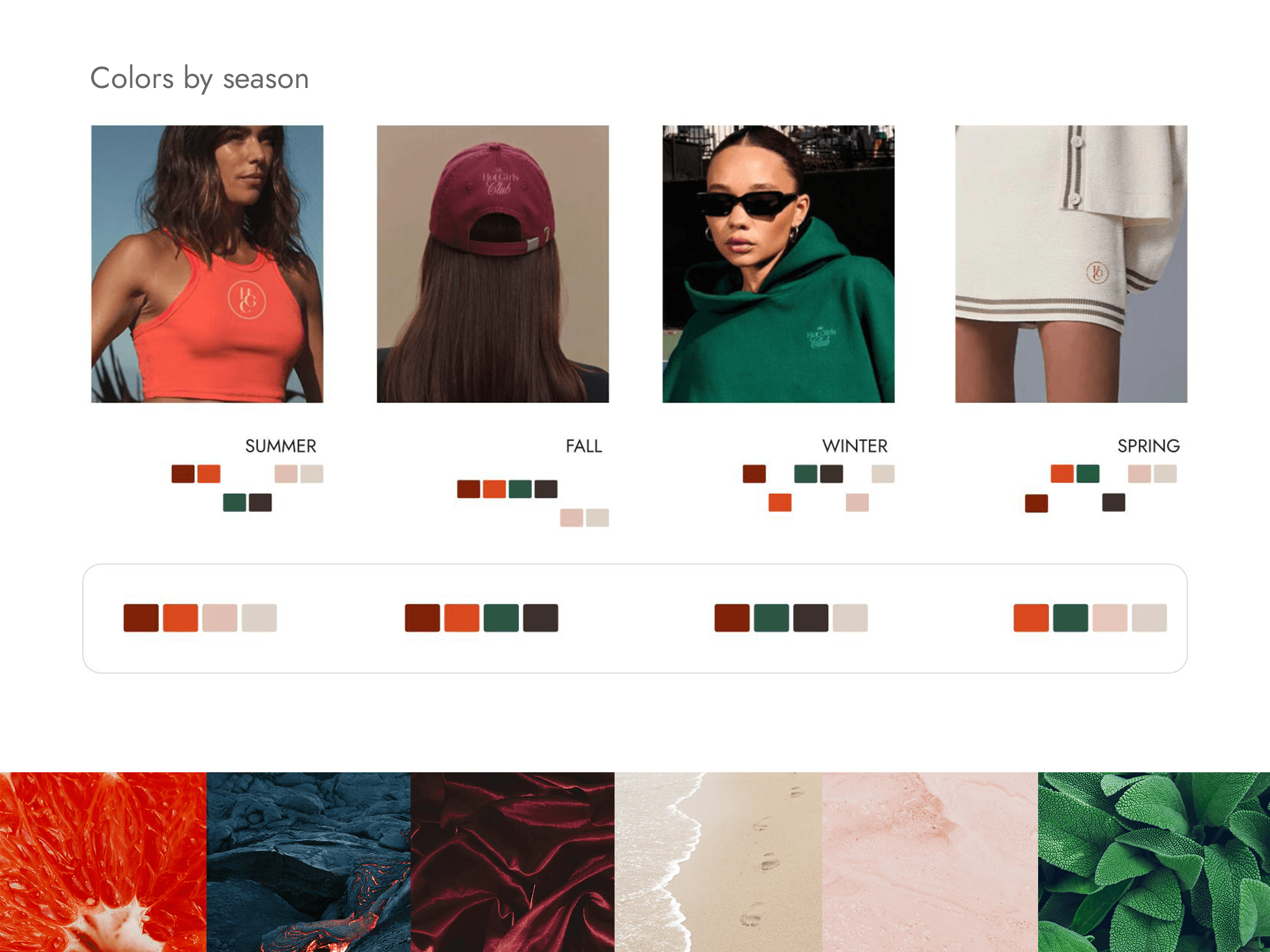
We explored a bold, vibrant route and an old-money wellness route to calibrate color, mood and intensity. After defining the visual style, we iterated further on the color palette until we landed on the final, editorial yet approachable identity.
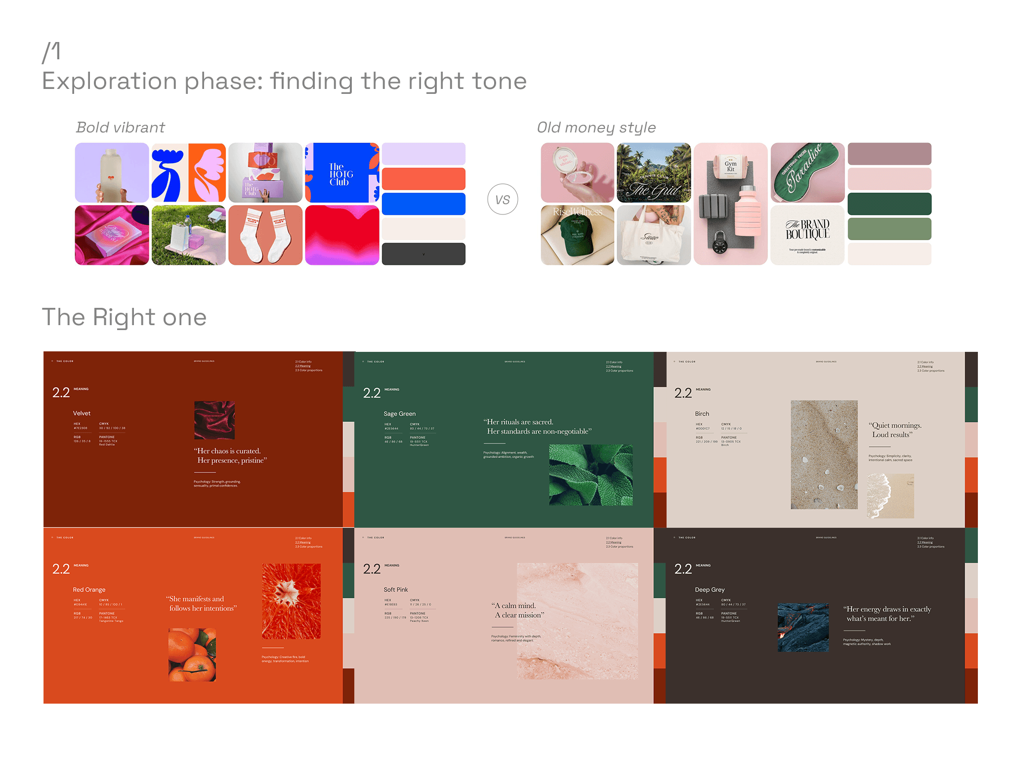
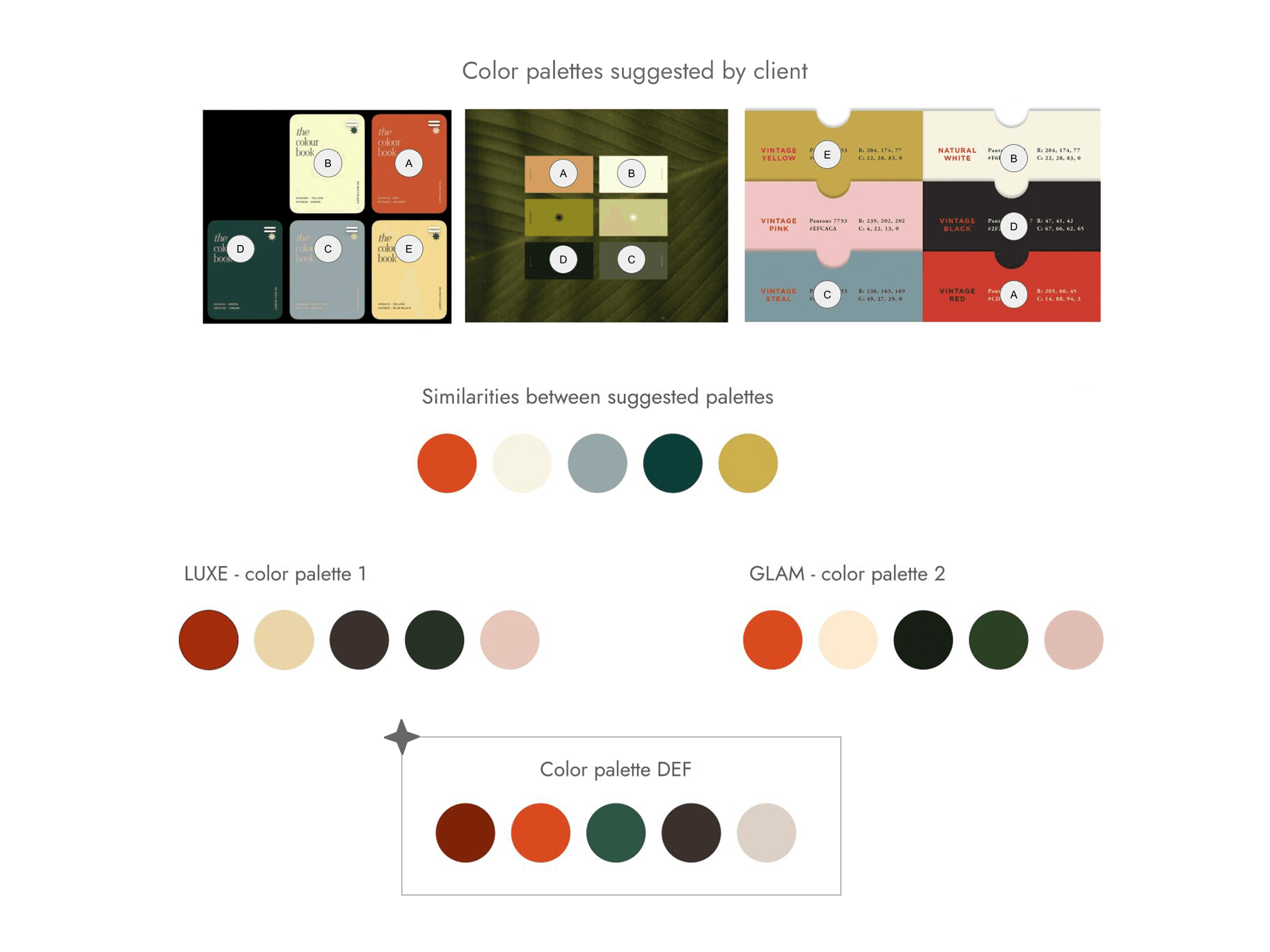
The color phase was one of the trickiest parts. The client struggled to connect with the initial palettes, so they shared their own visual references. From there, we mapped the common threads in those images to build a “master palette” that guided us toward the final colors. It was a messy, iterative stretch that felt like a lot of circling… but it’s what finally allowed us to ring the bell on a palette everyone genuinely loved.
Takeaways
Building The Hot Girls Club proved that a strong strategic backbone can survive a messy, very human creative process. In the end, THGC leaves me with three key takeaways:
Strategy first, visuals as a response, not the other way around.
Exploration is valuable, as long as it’s framed and documented with intent.
A wellness brand must be both a feeling and a business engine: community, experiences and products all speaking the same language.
The brand strategy always aligns the team and speeds up decisions with less rework.
Leaning on design thinking helps refine options and align everyone on the right direction.
See IG here: The Hot Girls Club